Brand Guidelines

Great Lakes Gaming
Royal purples, highlighting blues, and touches of light and dark combine to create engaging elements and pursue a single sided presence.
While some places dictate exact colors, the style implemented further utilizes various shades and dimensions of color-leaving us with a range of tonality rather than 2 or 3 single colors.
Base Logo
Download our Base Logos to easily incorporate it into your existing graphics.
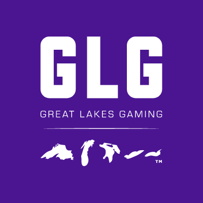
The Great Lakes Gaming logo was designed with premium in mind. A logo you would find fitting of a country club, and stand out from other video game / esports logos.
The GLG is big and bold, to capture the eye, with the full company name beneath to underline.
The five Great Lakes are organized left to right in the order they appear geographically. They also are organized to represent 5 Stars for GLG’s persistence on upholding the best experiences for all who visit and compete with GLG.
Font Overview
Fonts can be found on fonts.adobe.com.

GLG Colors
